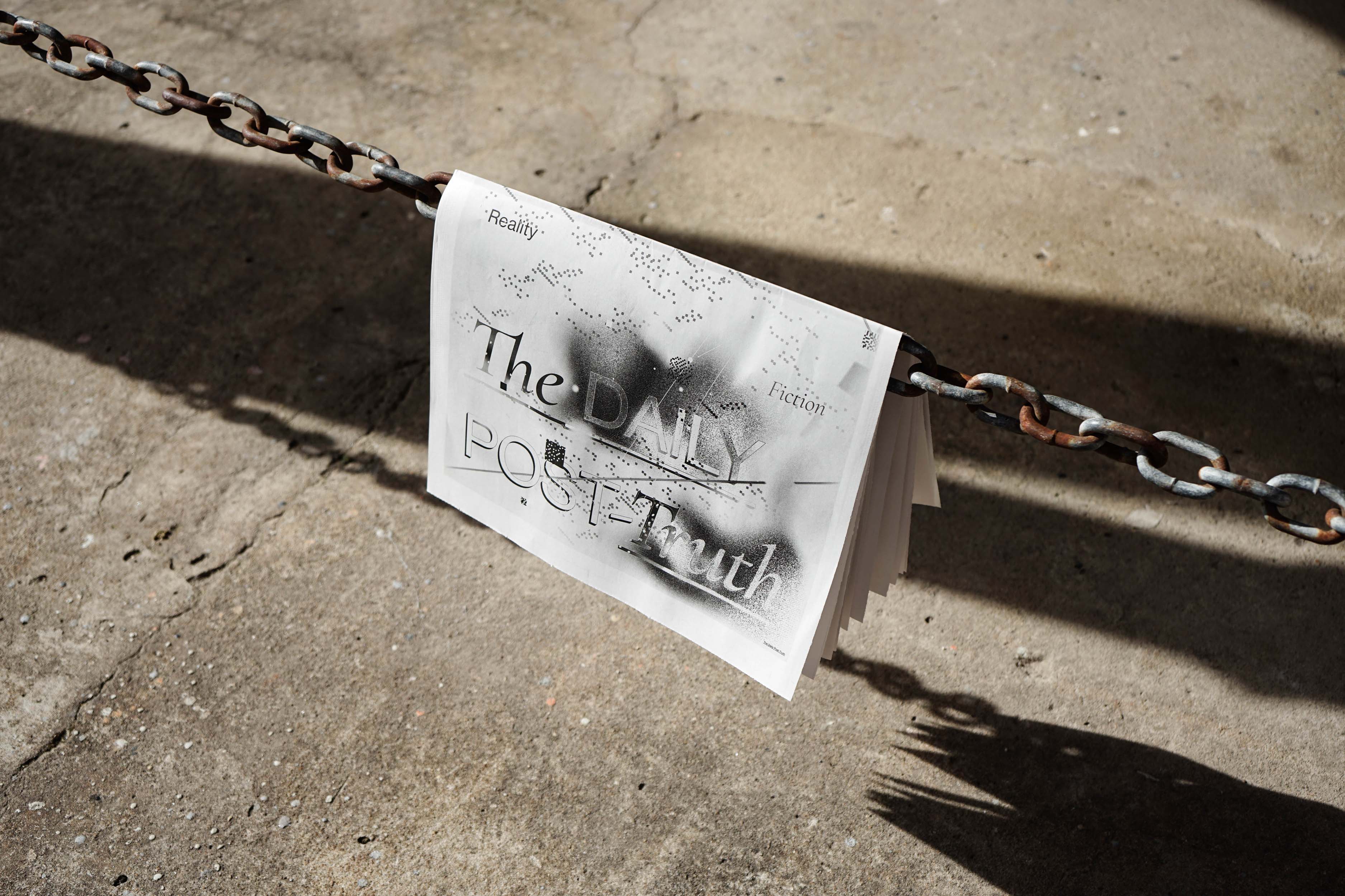
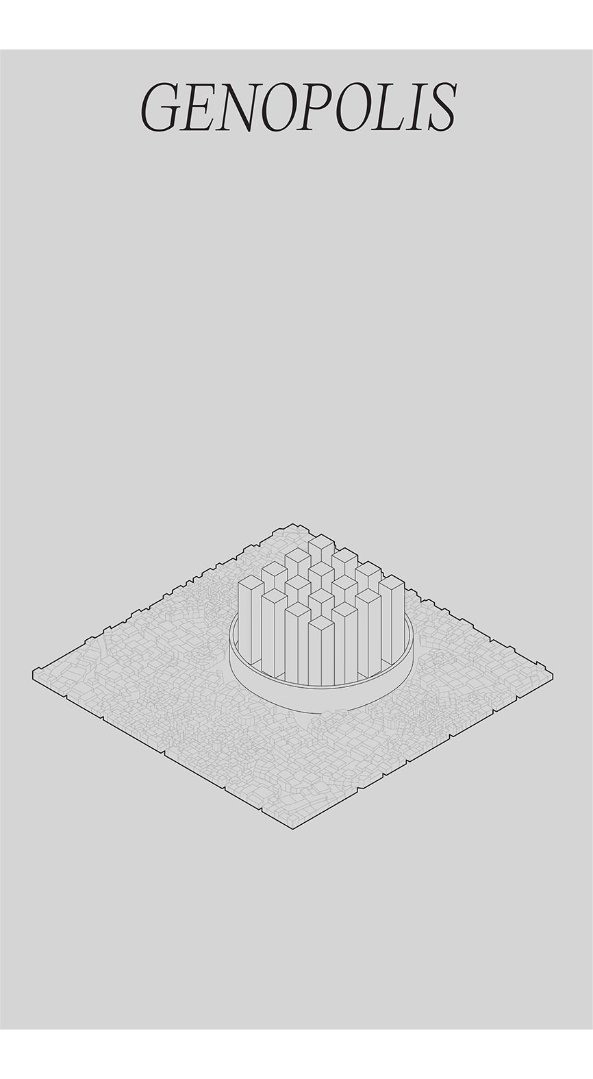
THE DAILY POST-TRUTH
EDITORIAL DESIGN, WRITING
2020-2021
Editorial design and writing for a journal produced in collaboration between Maat and the Faculty of Fine Arts, Lisbon.
By creatively exploring this publishing model in crisis, The Daily Post-Truth proposes the development of a newspaper, while focusing on the tensions between truth and post-truth, fiction and reality. “The Daily Post-Truth” uses fiction as the basis for a speculative and critical design practice that seeks to question the tenets of the dissemination of disinformation in the post-truth era. The newspaper was developed in a four-day workshop at maat in January 2021, coordinated by António Nicolas, Luísa Ribas and Sofia Gonçalves, with students of the master’s degree in Communication Design: Abel Quental, Beatriz Pinta, Diogo Lourenço and Madalena Lopes.
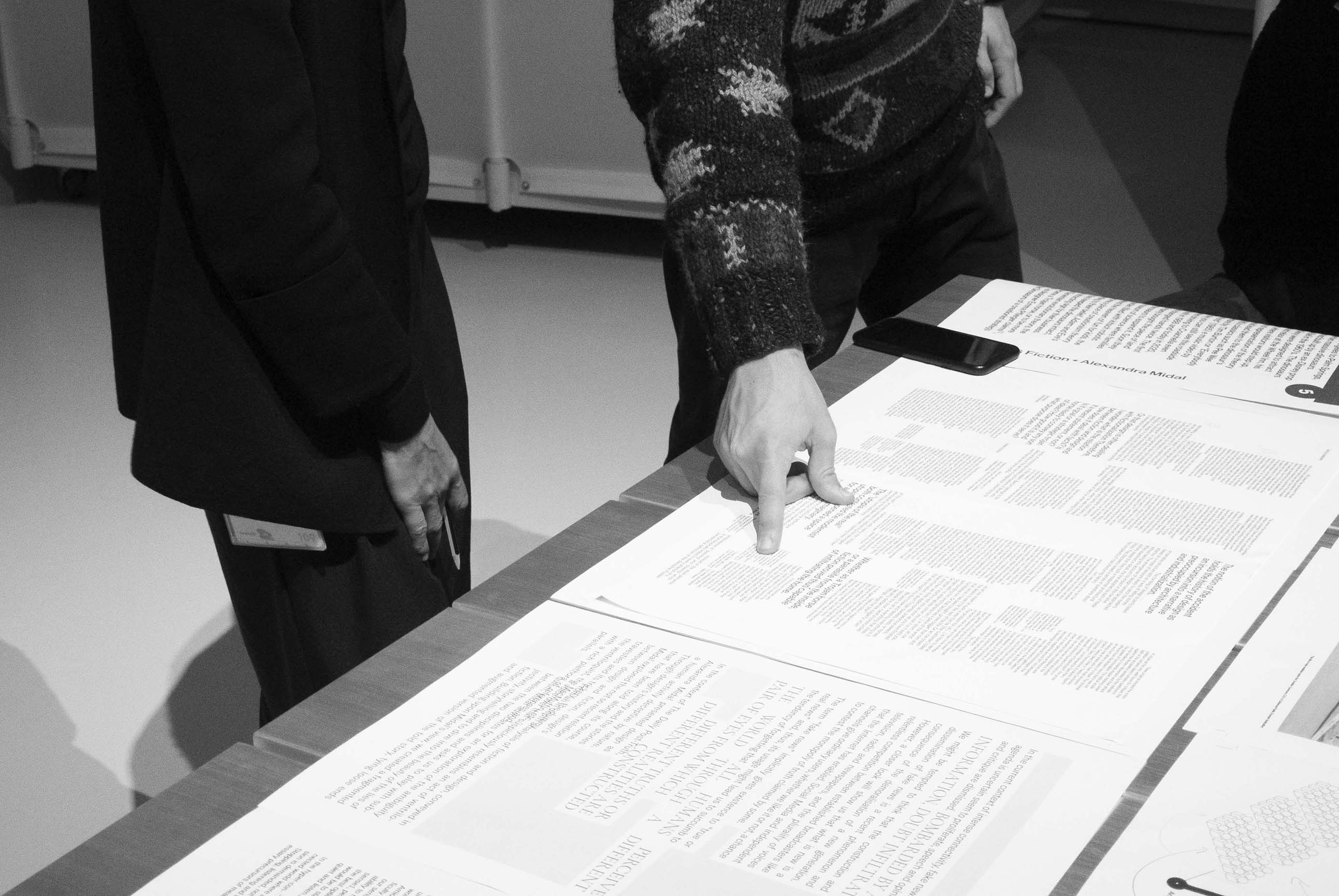
Featured in the journal, Extended Marginalia on Design and Fiction, a text co-written with Madalena Lopes, presents a fragmented expansion of Alexandra Midal’s lecture Design is Fiction by picking up clues and constructing associations in the form of loose ends, new knots and parallels.
Lectures by Alexandra Midal and Paulo Pena are available online on maat ext. antenna and the journal is distributed freely at the museum.
CONCEPT AND COORDINATION
António Nicolas, Luísa Ribas, Sofia Gonçalves (FBAUL, Communication Design Department)
Nuno Carvalho (maat)
DESIGN
Abel Quental (Project Coordination)
Beatriz Pinta, Diogo Lourenço, Madalena Lopes (Design Team)
PUBLISHER
maat
TRANSLATING AND PROOFREADING
Luísa Yokochi, Dominic Zugai (Kennis Translations)
SPECIAL THANKS
Alexandra Midal, Paulo Pena, Francisco Soares, Nuno Paula, Carmo Leitão, Maria Leonor Carrilho, Rita Marques, Lisa Hatje Moura
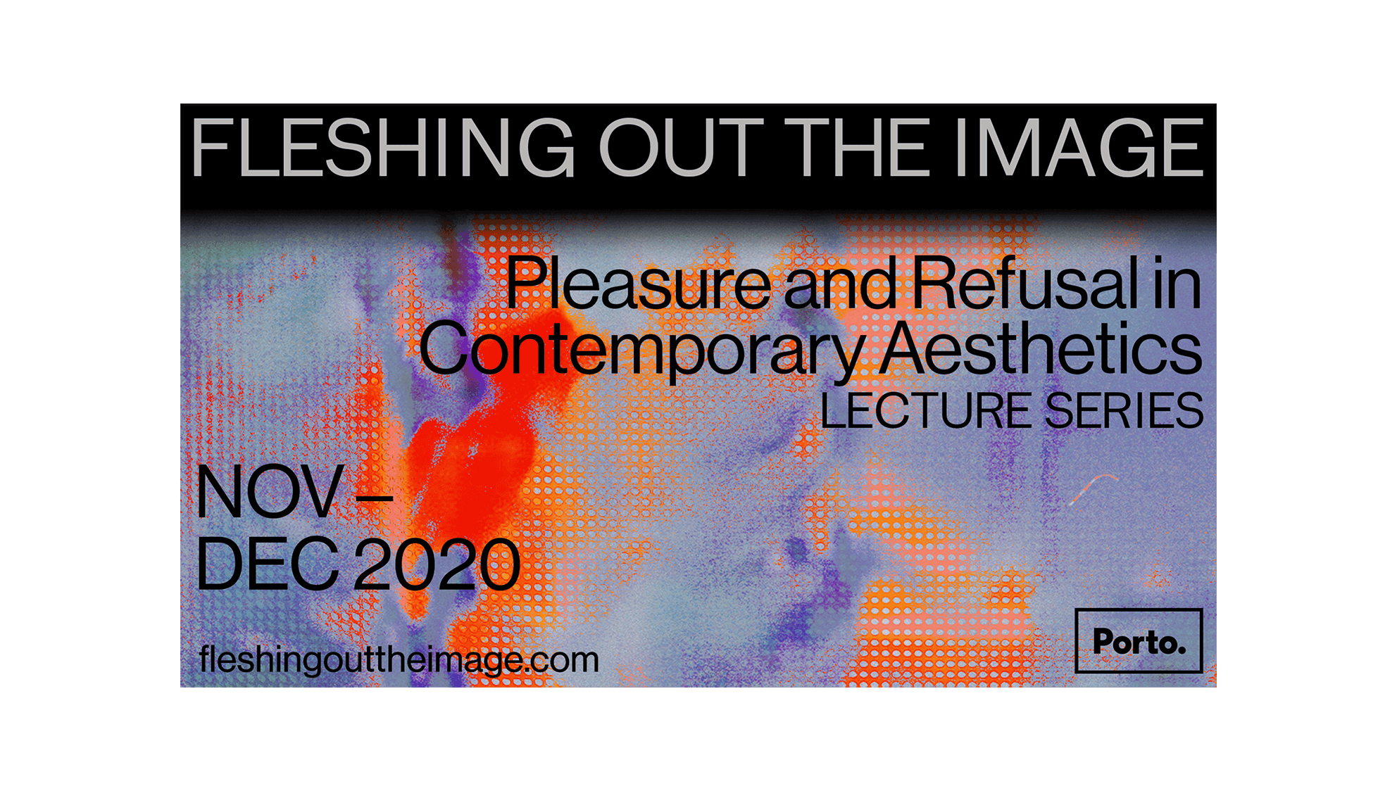
FLESHING OUT THE IMAGE
VISUAL IDENTITY, WEB DESIGN
2020
Visual identity and website design for an artistic project based in Porto, Portugal.
The project thus inquires into the visual-sonic experience as both embodied and embodying, as grounded in the multisensoriality of the embodied encounter with cinematic technologies, and as constitutive of bodies, subjects and ethical orientations.
The programme consists of an artistic and curatorial residency in Porto; the exhibition project CHAMBER, on view at the Carlos Alberto Chapel in Porto; and a lecture series entitled FLESHING OUT THE IMAGE: Pleasure and Refusal in Contemporary Aesthetics which will be made available on this website throughout November and December 2020. Speakers in the series include Tina Campt, Alexander Ghedi Weheliye, Amber Jamilla Musser, Tavia Nyong’o, Zakiyyah Iman Jackson and Denise Ferreira da Silva. To see the full project visit fleshingouttheimage.com.
PROJECT
Daniela Agostinho
Ana Cristina Cachola
Igor Jesus
GRAPHIC DESIGN + DEVELOPMENT
Beatriz Pinta
LECTURE SERIES SPEAKERS
Amber Jamilla Musser
Tavia Nyong’o
Zakiyyah Iman Jackson
Denise Ferreira da Silva
Tina Campt
Alexander Ghedi Weheliye
CHAMBER + SOUND LIBRARY
Igor Jesus
EXHIBITION PHOTOGRAPHY
Pedro Magalhães
With the support of Criatório programme for Visual Arts and Curating.
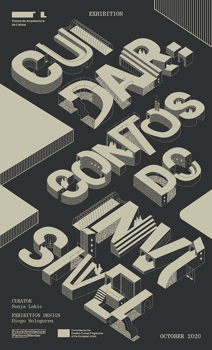
CUIDAR: CONTOS DO INVISÍVEL
VISUAL IDENTITY, EXHIBITION GRAPHICS
2020
Visual identity and graphics for architecture exhibition commissioned by the Lisbon Architecture Triennale.
IN COLLABORATION WITH
Estonian Museum of Architecture, Tallinn; Museum of Architecture and Design, Ljubljana; MAXXI National Museum for 21st Century Arts, Rome
CURATOR
Sonja Lakić
EXHIBITION DESIGN
Diego Sologuren
COORDINATION AND PRODUCTION
Tiago Pombal
FEATURING WORKS
Franco Purini and Laura Thermes, with Ugo Colombari, Giuseppe De Boni, and Duccio Staderini, (Tales of Non-Architectures - Rome); Albert Trapeež, Leonhard Lapin, Sirje Runge, Villen Künappu, Ain Padrik, Jüri Okas, Tiit Kaljundi, Toomas Rein, Veljo Kaasik, Jaan Ollik, Ülevi Eljand, Tōnis Vint, Harry Šein, Juhan Viiding, Avo-Himm Looveer, and Matti Õunapuu (Tales of the Permissible - Tallinn); Elza Budau, Sonja Bitenc, Katarina Bebler, Dašenka Cunja, Marta Čeč, Majda Debevc, Nevenka Furlan, Marlena Humek, Špela Kalin, Stanislava Staša Kompare, Marjana Kosec, Marta Košir, Alenka Kovač, Andreja Kranjc, Majda Kregar, Jana Omersa, Anica Vidmar, and Mojca Vogelnik (The Paperers’ Tale, Smer B - Ljubljana)
GRAPHIC DESIGN
Beatriz Pinta
CONTENT REPRODUCTION (The Paperers Tale)
Ricardo Batista
David Rodrigues
EXHIBITION PHOTOGRAPHY
Hugo David
EDUCATIONAL ACTIVITIES
Letícia do Carmo
Ricardo Batista
EDITING AND TRANSLATION
Vasco Corisco
Ana Guedes
CONSTRUCTION AND ASSEMBLY
Gate 7
EXHIBITION ASSISTANTS
Ester Donninelli
Inês Moura
Joana Fernandes
RIFE MAGAZINE
VISUAL IDENTITY, WEB DESIGN, WRITING
2020
Digital magazine operated by Hiatus Collective.
A digital magazine entitled Rife—initially created within the discipline of Editorial Design in the MA of Communication Design at the Fine-Arts Faculty of Lisbon—emerged as a response to the pandemic condition and its global effects on the individual, social, political, ambiental and cultural levels, raising questions surrounding what we know as our reality at this day in age. These questions are made and answered by designers, now being opened to a greater spectrum of creatives. This is pertinent as we creatives operate within our contexts, and in order to render ethical alternatives to realities presented, we must investigate and understand them. At the moment we were quarantined, we were physically inhibited to circulate freely, so we turned to question how to circulate content digitally—not by option but by necessity—, thus revealing a doorway to cultural production in the digital world and simultaneously embracing the democratic distribution of the open source medium that is the internet.
SOCIAL MEDIA MANAGEMENT
Beatriz Pinta
Nádia Alexandre
Sofia Cavaquinho
EDITORIAL BOARD
Hiatus Collective
CREATIVE DIRECTORS
Hiatus Collective
EDITING AND CONTENTS
Hiatus Collective
+ Guest contributors
COPY EDITOR
Beatriz Pinta
WEB DESIGN
Hiatus Collective
DEVELOPMENT
Mariana Cordeiro
Manuel Silva
Nádia Alexandre
TECHNICAL SUPPORT
Rui Sampaio
RELATED PRESS
Featured in Form Magazine #289
Interview and feature in Collide 24
Interview in Elephant Art for Zine of The Month

Hence, our approach is founded on the perception that the effects of this historic period we are living are not primarily a burden, but a terrain in which new ways of thinking and producing may come to light. Using design and our knowledge to stimulate discussion as we believe our responsibility is, we aim to raise questions about realities, cultural decisions, ethical and political actions, exploring new practices and emerging technologies inside and outside design.
The name of the collective came about as a reflexion on the condition we were forced into. As graphic designers, and most importantly as creatives, are few of the least affected in our daily production by working remotely due to the digitalization of our tools. However, as the pandemic unfolds, regular daily operations were put on hold, indefinitely. And so did we. HIATUS in its definition—a break in continuity in a sequence or activity—represents the temporal space in which we came together as a collective in an attempt to counter the silence of being put dormant, thus rendering the collective as a productive force in idle times and the coming period of adaptation into the unknown.
HIATUS COLLECTIVE
Beatriz Pinta
Mariana Cordeiro
Manuel Silva
Nádia Alexandre
Sofia Cavaquinho
APPARATUS ARCHITECTS
WEB DESIGN
2020
Website design for Lisbon-based architecture office Apparatus Architects.
Designed to put images first – whether static or moving –, the website showcases the work of the multidisciplinary architecture office which spans though different scales, from object design to urbanism. In showcasing the projects, the importance was to create a container for technical drawings, imagery and references that resembles architectural presentation boards, making the website appealing for both potential clients and architects.
COLLABORATION
Nádia Alexandre
UNEXPECTEDLY ABSENT: THE HALT OF REMOTE INTIMACY
CORPORATE IDENTITY, EDITORIAL DESIGN, WEB DESIGN, AUDIOVISUAL
2020
Corporate identity and editorial design within the framework of a speculated cenario.
In The Manifesto for the Truth (2013), Edward Snowden calls for transparency regarding data processing in the context of mass surveillance. Accusing governments of obscuring the truth regarding personal data usage and hindering the debate of the theme, the whistle-blower urges the availability of knowledge and the protection of human rights.
Unexpectedly Absent: The Halt of Remote Intimacy addresses the issue of data rights as a fundamental human right through the creation of a fictitious company, VERAX. The organisation presents itself as a beneficent entity, advertising counter-surveillance products and obfuscation strategies—from browser plug-ins to fashion—reclaiming users’ data rights. VERAX grants digital opacity and the re-inscription of such rights to its clients and through its extensive catalogue of obfuscation tactics comprising a variety of formats, which are marketed in the company’s website.
As a project, Unexpectedly Absent combines a commercial element, the promotion of a lifestyle and commerce around products to render your digital presence opaque, with the democratic act of disseminating knowledge around counter-surveillance, creating a layer of strangeness. This incompatibility presented in the project aims to promote the debate around data rights and present a criticism to its commercialisation.
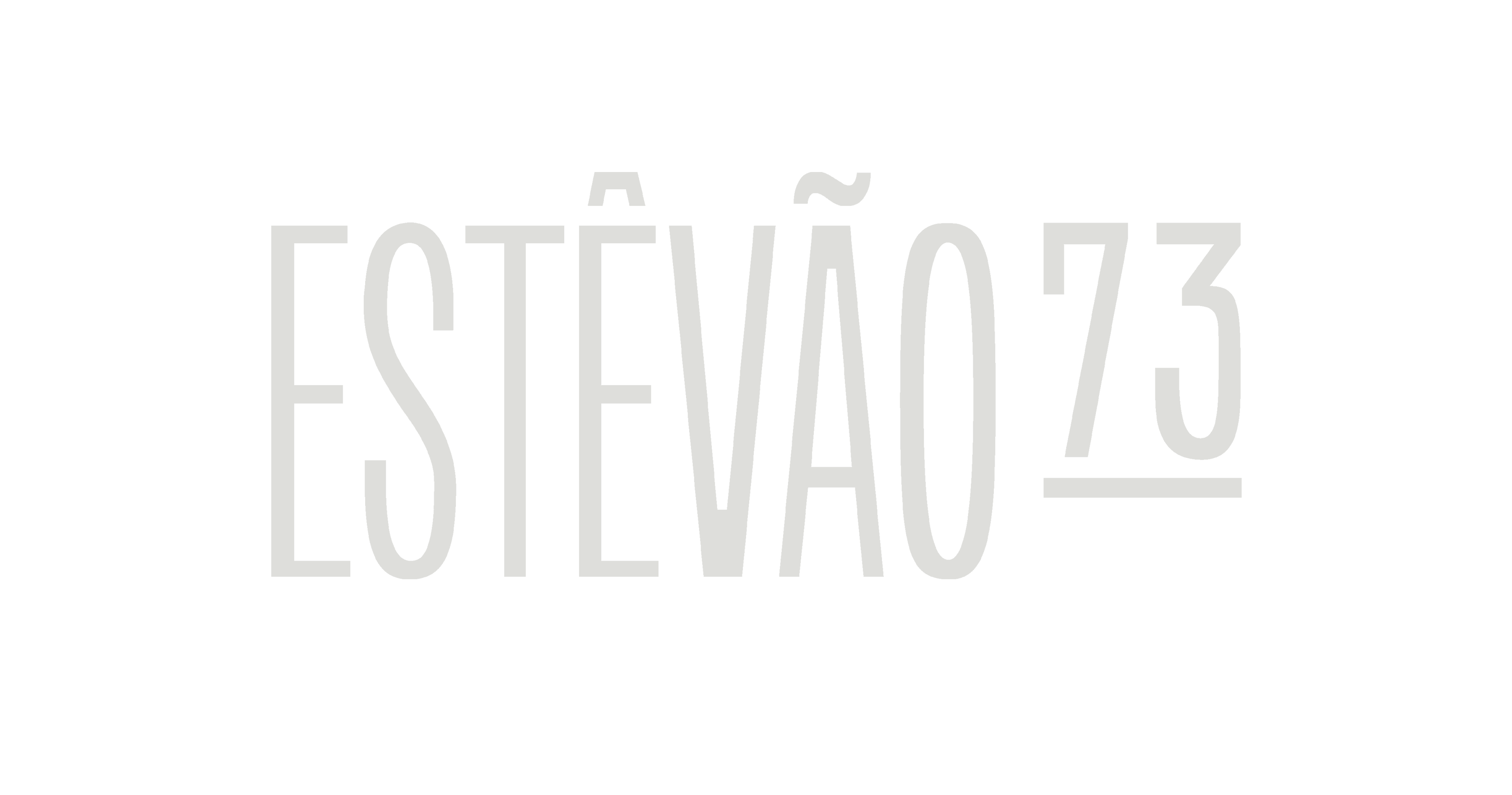
ESTÊVÃO 73
VISUAL IDENTITY, TYPE DESIGN, WEB DESIGN
2020
Visual identidy, custom typeface and web design for Estêvão 73, high end residencial property in Aveiro, Portugal.
Cinco Paredes
RENDERS
nu.ma
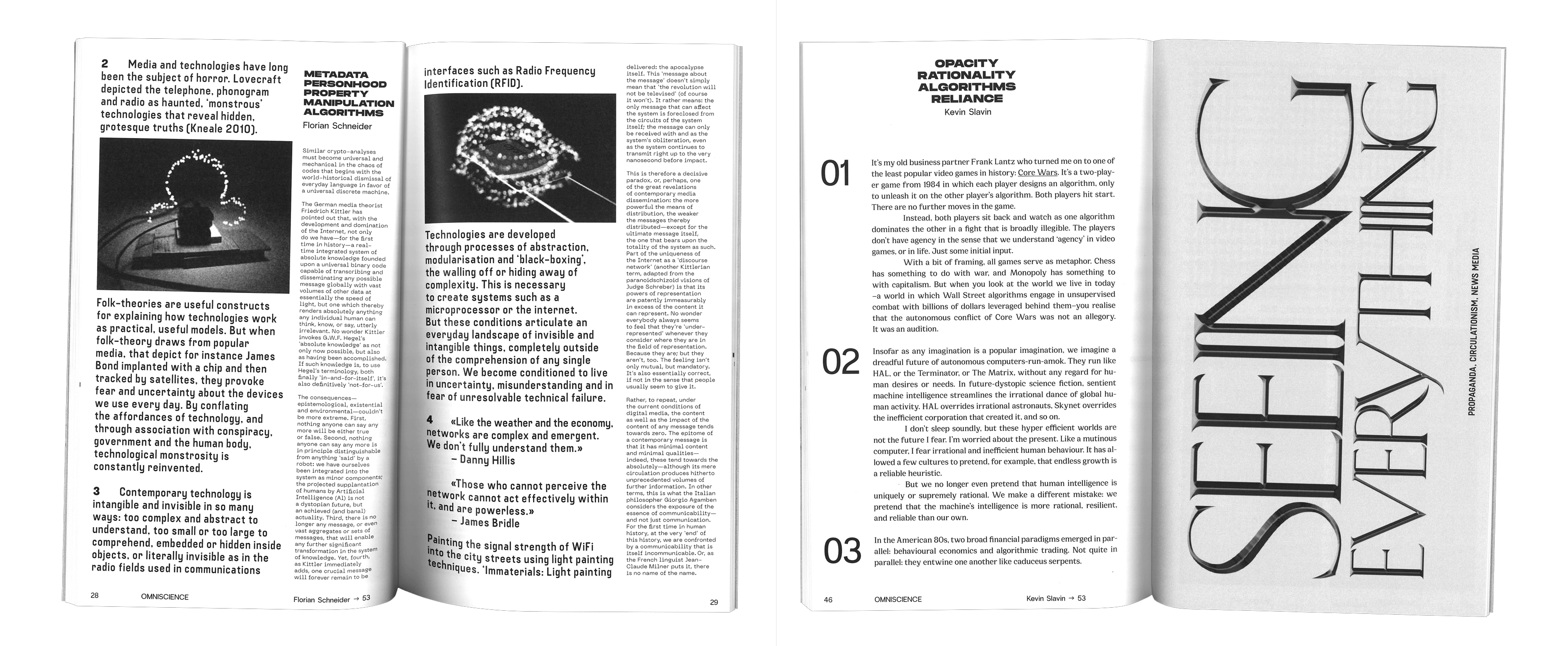
OMNISCIENCE
EDITORIAL DESIGN, WEB DESIGN
2020
Compilation of texts and projects from a research on mass surveillance.
Omniscience is a project that stemmed from a research on mass surveillance. The main artefact of this project, an edited book, compiled a series of texts and projects on the research subject of mass surveillance that address concepts such as immaterial property, human rights and the societal contemporary state of Narcissus-narcosis—whether directly or indirectly—, alarming the reader of the opacity of such networks in which surveillance is nested. The website, on the other hand, functions as an expansion on the theme in question. Unlike the manner in which questions are posed in the research texts, represented on the left-side, the queries here are presented through an endless loop of fragments of news articles and projects that seem to blur the boundaries between cautionary tales and reality. We can’t help but wonder, to what extent will mass surveillance and the collection of data will continue to wrench the concept of property and human rights in a world where information is the ultimate pharmakon.
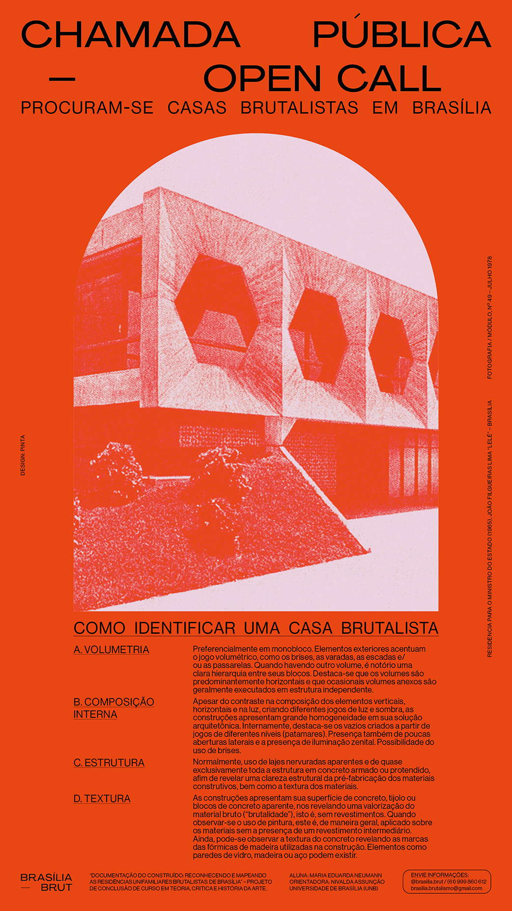
BRASÍLIA BRUT
VISUAL IDENTITY, COMMUNICATION
2020–ONGOING
Communication project for uncatalogued brutalist homes in Brasilia, Brazil.
PROJECT
Maria Eduarda Neumann
GRAPHIC DESIGN
Beatriz Pinta

IT TAKES SEVERAL MINUTES FOR THE EYES TO ADJUST TO THE DARK
VISUAL IDENTITY, COMMUNICATION, EXHIBITION DESIGN
2019
A graduation exhibition, book and website on design, reality and fiction.
In the post-digital era, reality and fiction have been diluted. The expression of this lack of definition isn't limited to just creative and artistic endeavours, but is often weaponized by various power structures, whether formal or informal. This instrumentalization deconstructs core values such as democracy, individual and collective identity, ethnicity, and other fundamental principles of our society.
Before this current and 'desirable' identity crisis, design always worked with and for reality. Its objects belong, circulate, and (re)construct reality. The frailty of the majority of communication design objects also contributes to this idea of a practice that 'serves' the present. In short, the inevitable shock with reality defines the social status of design. If 'design and reality' is a (false) truism, "design and fiction" might appear to be an improbable hypothesis. In the face of historical, legitimized practices—such as literature or cinema—design now reclaims its place in fiction.
At the end of another cycle of study in communication design at the Lisbon Faculty of Fine-Arts, we have gone over the dilemmas, the contradictions and the themes that pertain to contemporaneity. Through the projects produced this year, the students have either commented, critiqued or essayed reality, or turned it into fiction. We've steered very close to cinema, literature, mythology, but also to the hard truths of a reality that insists on presenting itself, suprising us, and deconstructing itself before our eyes.
PUBLICATION
Editing: António Nicolas, Sofia Gonçalves
Design: Afonso Matos, Inês Pinheiro, Vitor Serra
Copy Editing: Sofia Gonçalves
Image Editing: Afonso Matos, Inês Pinheiro
EXHIBITION
Curators: António Nicolas, Sofia Gonçalves
Project Selection: António Nicolas e Sofia Gonçalves (Design de Comunicação IV e V), Sofia Rodrigues (Design Editorial I e II)
Exhibition Design: Beatriz Pinta, Nádia Alexandre
Production Assitance: Manuel Silva, Mariana Cordeiro, Rui Sampaio, Laboratório de Escultura (André Filipe, Eduardo Brito)
CULTURAL PROGRAMME
Afonso Matos, Ana Cavaleiro, Sara Vicente
WEBSITE
Editing: António Nicolas, Sofia Gonçalves
Design and Development: Diogo Lourenço
Technical Assitance: Abel Quental, Bruno Santos, Tiago Nunes
COMMUNICATION PROJECT
Afonso Matos, Beatriz Pinta, Diogo Lourenço, Inês Pinheiro, Nádia Alexandre, Vitor Serra
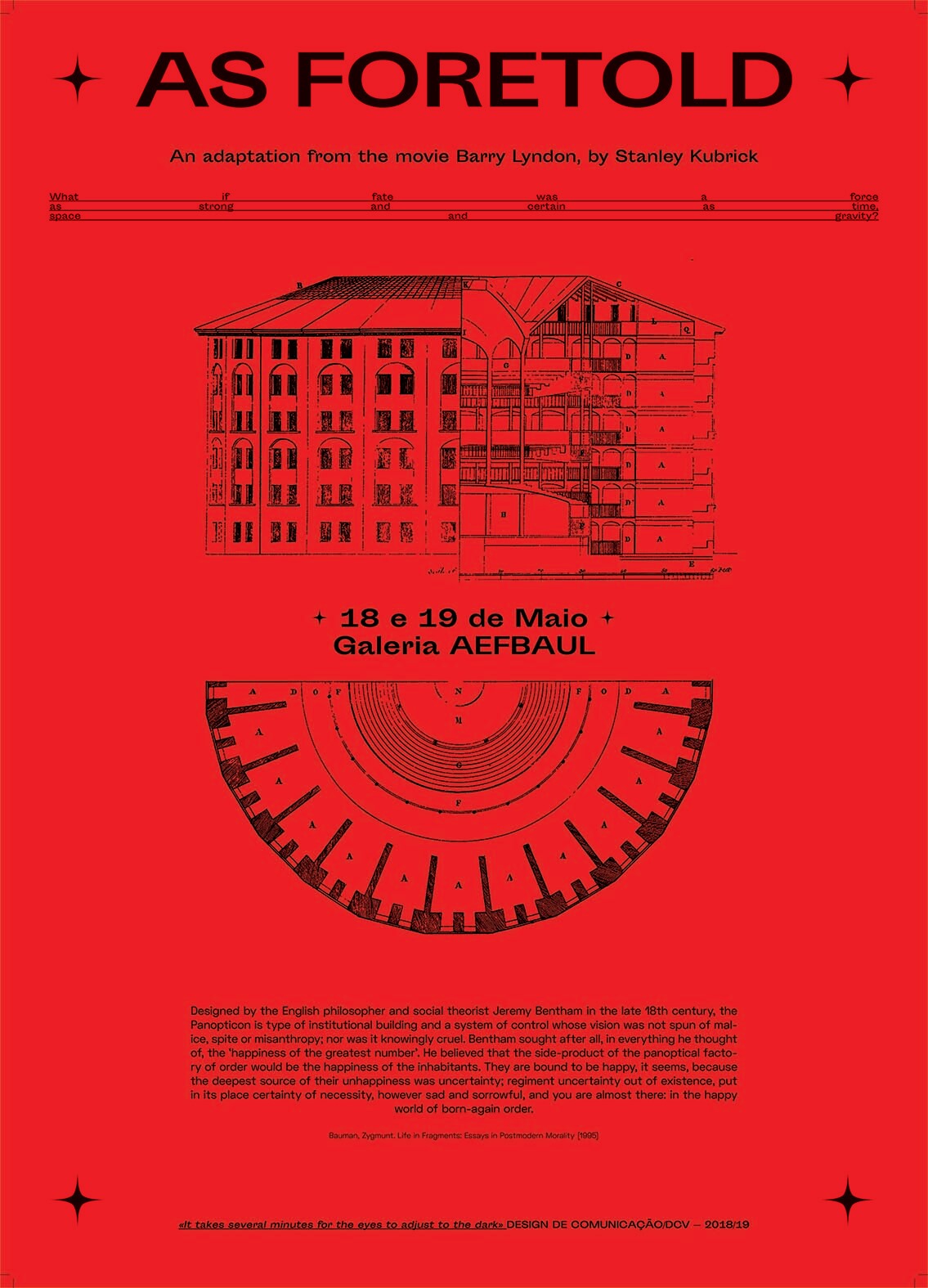
AS FORETOLD
EDITORIAL DESIGN, AUDIOVISUAL, INSTALLATION
2019
A fiction of a panoptical society governed by determinism.
The corrosive fear of uncertainty has been pinpointed to be one of the sources of chaos in the real world. As a form of mitigating the chaos, As Foretold addresses an alternate reality that generates prophecies for every of its inhabitants, in attempt to decrease the atmosphere of stress and anxiety of the population, and based on the idea that certainty—here appearing in the form of such prophecies—will install, at last, peace of mind. This way, destiny is as certain as space, time and gravity.
Suddenly, all activity and reactions in this simulation boils down to the very concept of certainty. Why is it that people are so bound by the comfort of it? Do they believe they can alter the outcome? If you hold a «fatalist» prophecy, ambivalence or impending doom may be evident, but who is it to say that an «optimist» prophecy would not make the clocks turn? After all, chaos, the fear of chaos actually invites more chaos. And so on and so forth… So is it worth craving love and gold, if everything goes as foretold?
COLLABORATION
Diogo Lourenço
Helena Barradas
PREFACE
On the year of 1977, NASA launched the twin Voyager 1 and 2 spacecraft into space. The mission objective of the Voyager Interstellar Mission (VIM) in its ongoing journey is to extend the NASA exploration of the solar system beyond the neighbourhood of the outer planets to the outer limits of the Sun's sphere of influence, and possibly beyond. In August 2012, Voyager 1 made the historic entry into interstellar space, the region between stars, filled with material ejected by the death of nearby stars millions of years ago. Voyager 2 entered interstellar space on November 5, 2018 and scientists hope to learn more about this region. Both spacecraft are still sending scientific information about their surroundings through the Deep Space Network, or DSN.
Aboard of the Voyager 1 and 2, NASA placed a kind of time capsule intended to communicate a story of our world to extraterrestrials. Selected for NASA by a committee chaired by Carl Sagan of Cornell University, et. al. Dr. Sagan and his associates to portray the diversity of life and culture on Earth, the contents of the phonograph record—a 12- inch gold-plated copper disk—include 115 images and a variety of natural sounds, musical selections from different cultures and eras, and spoken greetings from Earth people in 55 languages, and printed messages from President Carter and U.N. Secretary General Waldheim. The 115 images encoded in analog form in the Golden Record depict scientific knowledge, human anatomy, human endeavours and the terrestrial environment —all these aspects are vital pieces of information in building a vision of what humanity entails and where it inhabits. Ultimately, it contextualises society and its environment and is thus a direct reflection of both, it is a snapshot of our world as we know it (or knew until the 1970s).
Now what if we were to portray and communicate contemporary society through imagery? First one would have to possibly come to a conclusion on what is contemporary society characterised by, what is its character. In the context of hyper-information, increasing human interconnection yet a feeling loneliness, of ambivalence and uncertainty—all topics raised by Polish philosopher Zygmunt Bauman in his legacy of readings on liquid modernity—, the post-modern times are characterised by the generation of millennials. Such individuals, born between the 1980s and 2000, were the first generation to be born alongside global internet, and thus witnessed the birth of memes.
As noted by Metaheven in Can Jokes Bring Down Governments (2014), the notion of the “meme” was introduced by the evolutionary biologist Richard Dawkins in the late 1970s as a way to describe what he called a “cultural gene.” Memes are units of culture and behaviour, which survive and spread via imitation and adaptation. Part of their appeal is that memes spread spontaneously. Paul Mason, the BBC’s travelling chronicler of all things crisis-related, found that “with the internet [...] and above all with the advent of social media, it’s become possible to observe the development of memes at an accelerated pace […]." The three qualities that define the success of memes are longevity, fecundity, and copying-fidelity. Longevity indicates how long a meme can last. Fecundity applies to the appeal of a meme, whether it is catchy. Copying-fidelity is about the strength of a meme to withstand mutation in the process of copying and imitation. It determines how much of the original core remains intact when the meme is in transmission.
According to Richard Dawkins, a meme is a ruthlessly pervasive idea that applies to phenomena we see all around us (Metahaven, 2014), it is unavoidably a reflection of its own time and culture. Thus, it seems likely that portraying contemporary society through the lens of the millennial phenomena, the meme, might be the most effective way of obtaining a snapshot of this generation.
For being strictly digital content, of easy accessibility and spread, it has much to say about the society in which it spreads and replicates from the brash uncensored language, dark humour to the topics they may cover. In the aforementioned book, Metahaven argued that memes play a distinct role in protest, equating them to “political posters” to the resistance of the past, but that is the tip of the iceberg. The fact that memes draw references from pop culture and subcultures, it is a perfect system to display what are the greatest sources of media in current days—whether they are tv series, internet forums or short homemade video clips. Departing from such references, memes may stand as protest to the political atmosphere, as well as serve as form of mass comfort for shared beliefs and feelings, or purely entertain for the sake of the medium, unavoidably showing what we value today as a generation. In hindsight, much of the images herein demonstrate a great sense of irreverence towards many themes, which offers an even greater insight into what is to be a millennial.
In that sense, this book is built as a concept album, that is, an album in which its pictures hold an even larger purpose or meaning collectively than they do individually; where a selection of memes are catalogued and classified, then showcased in a selection of adapted replicas taken from the internet.
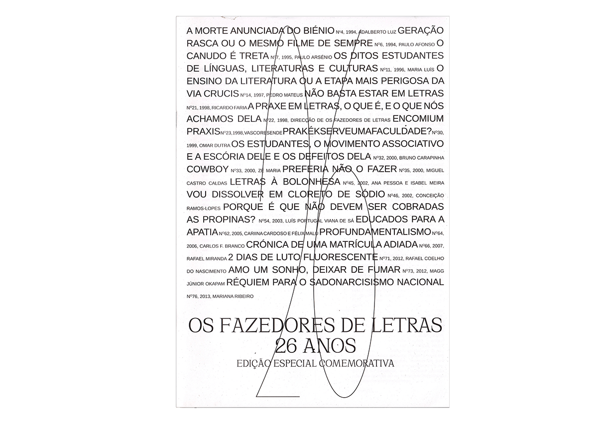
OS FAZEDORES DE LETRAS
EDITORIAL DESIGN, EXHIBITION DESIGN
2020
Special edition and exhibition celebrating 20 years of the journal Os Fazedores de Letras.
COLLABORATION
Afonso Matos
Inês Pinheiro
Vítor Serra
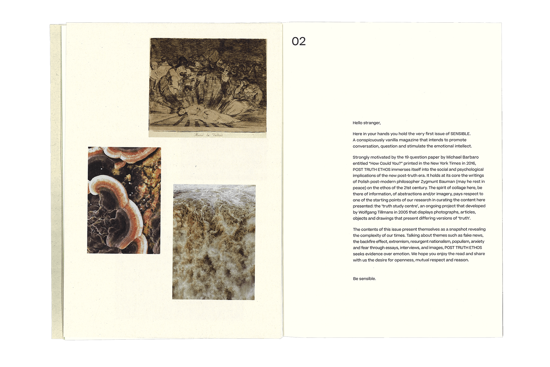
In the current context of negligence, a sense of loss of control and alienation of the world in regards to both domestic and foreign affairs that affect society on a global scale, Sensible organically emerges to address feelings in a world that is losing touch. Its intent is to promote sensible conversation at an individual level (ideally translating into the greater scale of society) about current global socio-political issues that generate much anxiety for us members of the human race. The bi-annual publication asserts its sensible character by deconstructing each issue’s theme with relevant academic and cultural content (book excerpts, interviews, imagery). That serves the purpose of connecting the readers of Sensible worldwide through our common perceptions and concerns around the themes of each edition.
The theme of its first issue arises from the shared sentiment of anxiety towards the implications of post-truth. Granted greater momentum during the American elections in 2016 and again during the Brazilian elections of 2018, the concept of post-truth has infiltrated politics and the way society manifests itself in unprecedented ways. Moving the focus away from the manipulation of technology as a political tool and the depth and breadth of fake-news, our stance is that this is now common knowledge and we must dig deeper—what are the social and psychological implications of the new post-truth era. Thus, we intend to promote conversation, question and stimulate the emotional intellect of our readers—only then can society comprehend the changes its going through and in turn mitigate the arising problems in a sensible manner.
P.S. there shall be no advertisement or journalistic gibberish within the safe space of Sensible.
COLLABORATION
Nereida Rubert